Back to Work
Design

Absa Group Full Branding Package

Designed a sophisticated brand identity that communicates executive-level credibility and consulting expertise through an intelligent lettermark system

Client Absa Group
Year 2025
Services Logo Design, Brand Identity, Visual Guidelines
Duration 2 weeks
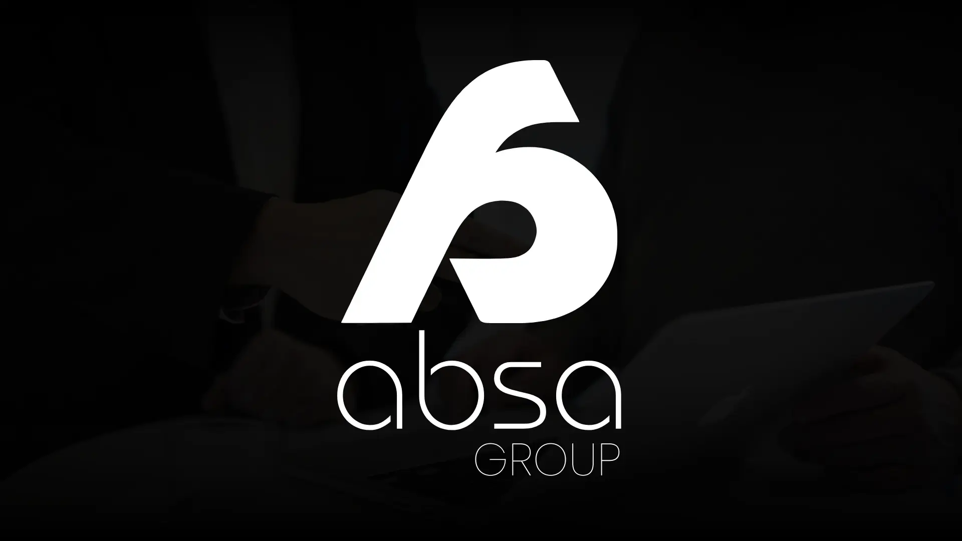
Absa Group Branding Hero Image

The Challenge

Absa Group operates in the highly competitive business consulting space, where first impressions determine whether a Fortune 500 company trusts you with strategic guidance or moves on to the next firm. Their visual identity needed to instantly convey premium expertise, strategic thinking, and executive-level credibility. In B2B consulting, businesses aren't buying products—they're buying trust. The brand had to feel sophisticated enough to command premium rates while appearing approachable enough to foster collaborative relationships. Without that premium visual foundation, even the best consulting insights struggle to land with C-suite decision-makers.

Our Role

We handled this project, delivering a complete brand identity package. This included designing a distinctive lettermark symbol logo, selecting and customizing the wordmark typography, creating combination logos for various use cases, developing a complementary brand pattern system, and establishing comprehensive visual guidelines for consistent application across all business touchpoints.

The Approach

Our strategy focused on creating a brand that feels intelligent, refined, and trustworthy without appearing cold or unapproachable. Business consulting demands a delicate balance: you need to project authority and expertise while maintaining warmth and partnership. We pursued a lettermark concept that would be both clever and memorable—something that rewards closer inspection but remains clean and professional at a glance. The goal was to create a visual identity that feels as thoughtful as the strategic consulting Absa Group provides to their clients.
Discovery & Research

We started by analyzing Absa Group's position in the business consulting market and understanding their client base—mid-to-large enterprises seeking strategic guidance, operational optimization, and growth consulting. Through discussions with stakeholders, we identified that their brand needed to communicate both sophistication and accessibility. We researched visual trends in the consulting industry, noting that many firms either lean too corporate (feeling impersonal) or too trendy (lacking gravitas). The opportunity was clear: design an identity that bridges premium professionalism with human approachability, creating trust through visual intelligence rather than visual intimidation.

Design & Development

We explored dozens of logo concepts and typeface combinations before discovering the lettermark solution that felt right. The breakthrough came when we realized we could integrate all four letters—A, B, S, A—into a single cohesive symbol. Each letter is embedded within the mark, creating a clever visual puzzle that reveals itself upon closer inspection. This approach perfectly mirrors what Absa Group does: they see the hidden patterns and strategic insights others miss. The design process involved testing countless variations of how the letters could intersect, overlap, and unify. We experimented with bold geometric fonts, refined serifs, and modern sans-serifs before landing on a typeface that balances corporate credibility with contemporary approachability. The final wordmark typography complements the symbol's intelligence while maintaining strong legibility across business cards, presentations, and digital platforms. We developed multiple logo lockups (symbol-only for social media, wordmark-only for document headers, combination for primary brand presence) to ensure flexibility. The accompanying brand pattern abstracts elements from the lettermark to create cohesive visual systems for backgrounds, marketing materials, and digital applications.

Final Design

The final brand identity centers on an intelligent lettermark that seamlessly integrates all four letters—A, B, S, A—into a unified symbol. At first glance, it's a clean, sophisticated mark. Upon closer inspection, each letter reveals itself, rewarding attention with clever visual design. This mirrors the consulting experience Absa Group provides: strategic insights that aren't immediately obvious but become clear with expert guidance. The wordmark typography adds professional polish, creating a complete identity that commands respect in boardrooms while remaining approachable in collaborative settings.

Brand Assets Delivered

Absa Group received a complete, production-ready brand identity system designed for immediate implementation across all business touchpoints. The comprehensive package ensures consistent premium positioning in every client interaction and business communication.

Complete Brand Package

  • Custom lettermark symbol logo featuring all four letters (A-B-S-A) integrated into a single intelligent mark
  • Wordmark logo using premium typography that balances corporate credibility with modern approachability
  • Multiple logo variations (symbol-only, wordmark-only, horizontal lockup, vertical lockup, reversed) for all use cases
  • Brand pattern system derived from lettermark elements for backgrounds, presentations, and marketing materials
  • Complete brand guidelines including color codes, typography rules, logo usage specifications, and spacing requirements
  • Print-ready and web-optimized logo files in all required formats (AI, EPS, SVG, PNG)

What We Learned

This project reinforced that the best logos tell a story, but they shouldn't require an explanation to work. The lettermark integration is clever, but the symbol still functions as a strong, recognizable mark even if someone never notices the hidden letters. We learned to resist the temptation to over-explain design concepts to clients—if the logo needs a paragraph of justification, it's probably too clever for its own good. The most challenging part was finding that balance between "intelligent design" and "overly complex design." If we were to approach this again, we'd invest more time early in defining exactly how much visual complexity the client is comfortable with—it would have saved several rounds of simplification. This experience shaped how we think about designing for professional services: trust is built through confidence, not cleverness.

Like what you see?

Let's create something amazing together

Start Your Project