Back to Work
Design

Curanova Full Branding Package

Designed a memorable medical AI brand identity with an innovative heart-pulse CN logo that instantly communicates healthcare technology while remaining minimalist and premium

Client Curanova
Year 2025
Services Logo Design, Brand Identity, Visual Guidelines
Duration 1 month
Curanova Branding Hero Image

The Challenge

Curanova needed a brand identity that would stand out in the rapidly evolving medical AI space while remaining instantly recognizable and trustworthy. The core challenge was creating a modern logo that stays in your mind and clearly indicates the medical industry without resorting to cliché medical crosses or generic health imagery. The logo needed to communicate both healthcare and technology—a delicate balance between human care and AI innovation. Medical AI companies often struggle with appearing either too clinical and cold or too tech-forward and impersonal. Curanova needed something different: premium, technological, yet warm and trustworthy—a brand that doctors and patients would both feel confident using.

Our Role

We handled all design for the complete brand identity package. This included conceptualizing and designing the distinctive symbol logo, selecting the perfect typeface to complement the symbol, creating comprehensive logo variations for different use cases, developing the brand color system, and establishing visual guidelines to ensure consistent application across all touchpoints.

The Approach

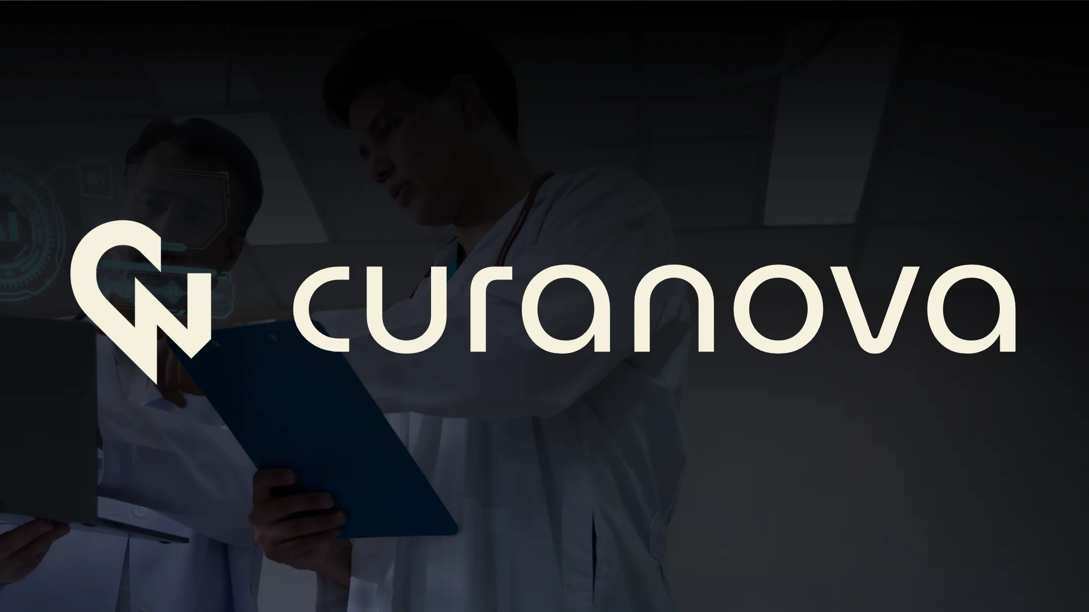
Our strategy centered on intelligent abstraction—taking the "CN" initials from Curanova and transforming them into a combined heart and heart-pulse graph shape that's both clever and meaningful. The approach was to create a symbol that works on multiple levels: it reads as the brand initials, it visually represents cardiac health monitoring, and it feels modern and premium. We prioritized clean geometry, precise curves, and a minimalist aesthetic that communicates technological sophistication while maintaining human warmth. The typography needed to reinforce these values—clean, modern, and premium—without competing with the distinctive symbol.

Discovery & Research

We began by analyzing the medical AI market and competitor branding strategies. Most medical AI companies use predictable visual language: literal medical symbols, blue and white color schemes, generic cross or heartbeat icons, or overly abstract tech imagery. This created a clear opportunity to differentiate Curanova through meaningful abstraction and sophistication. We researched successful health tech brand identities—companies like Oscar Health, Babylon, and Zocdoc—that communicate innovation through clean design rather than clinical sterility. We explored how cardiac monitoring visuals could be abstracted into memorable, elegant shapes. The key insight: the best medical logos balance scientific credibility with human approachability—they're professional without being intimidating.

Design & Development

We sketched dozens of "CN" concepts before discovering the heart-pulse graph structure could perfectly integrate with the letterforms. The breakthrough came when we realized the heart shape could form the "C" while the pulse line creates rhythm through the "N"—symbolizing both care and continuous monitoring. We refined the geometry obsessively—every curve, every pulse peak, every proportion calculated to achieve perfect visual balance. The symbol needed to work at 16px app icon size and large-scale medical displays, so we tested scalability relentlessly. For typography, we evaluated modern sans-serif typefaces that communicate medical precision and technological trust—something clean but not sterile, professional but not cold. The final typeface selection balances scientific credibility with approachability. We developed multiple logo lockups (symbol-only, wordmark-only, horizontal combination, vertical combination, reversed) to ensure flexibility across mobile apps, web platforms, medical devices, and marketing materials. The color palette evolved through multiple iterations to find the perfect balance between medical trust (calming blues) and innovation (vibrant accents)—avoiding cliché hospital aesthetics while maintaining healthcare credibility.

Final Design

The final brand identity features an innovative heart and heart-pulse graph-shaped "CN" symbol logo paired with clean, modern typography that communicates premium technological sophistication. The symbol logo is instantly recognizable—functioning as both the brand initials and a visual representation of cardiac health monitoring. The accompanying wordmark uses a geometric sans-serif typeface that shouts modern, minimalistic, premium, and technological without feeling cold or clinical. Together, they create a cohesive brand system that positions Curanova as the trustworthy, forward-thinking choice in medical AI.

Brand Assets Delivered

Curanova received a complete, production-ready brand identity system designed for immediate implementation across all medical AI touchpoints. The comprehensive package ensures consistent premium positioning in the competitive healthcare technology market.

Complete Brand Package

  • Custom symbol logo featuring innovative heart and pulse graph-shaped "CN" with precise geometric construction
  • Modern minimalist wordmark using premium geometric sans-serif typeface for medical-technological credibility
  • Multiple logo variations (symbol-only, wordmark-only, horizontal lockup, vertical lockup, reversed) optimized for all use cases from mobile app icons to large-scale medical displays
  • Brand color system balancing medical trust with innovative technology—avoiding clinical sterility while maintaining healthcare credibility
  • Complete brand guidelines including logo usage rules, color specifications, typography standards, and spacing requirements for medical applications
  • Print-ready and web-optimized logo files in all required formats (AI, EPS, SVG, PNG) with comprehensive file naming conventions

What We Learned

This project reinforced that medical branding requires a delicate balance—too clinical feels cold and intimidating, too friendly feels unprofessional and untrustworthy. We learned that the best healthcare logos reveal their medical connection gradually—the heart-pulse structure isn't immediately obvious to everyone, but once you see it, it becomes impossible to unsee. The biggest challenge was avoiding the trap of literal medical imagery—crosses, stethoscopes, DNA helixes—which feel dated and generic. If we were starting over, we'd prototype more variations exploring different cardiac monitoring visualizations earlier rather than spending time on unrelated medical symbols. The surprising insight: geometric precision matters exponentially more in medical branding than other industries—a single pixel misalignment or inconsistent curve radius destroys credibility because it suggests lack of precision, which patients and doctors cannot tolerate in healthcare. This experience fundamentally shaped our understanding of health tech design: clean minimalism executed with obsessive precision builds trust better than complex medical symbolism ever could.

Like what you see?

Let's create something amazing together

Start Your Project