Back to Work
Design

Digiteyes Full Branding Package

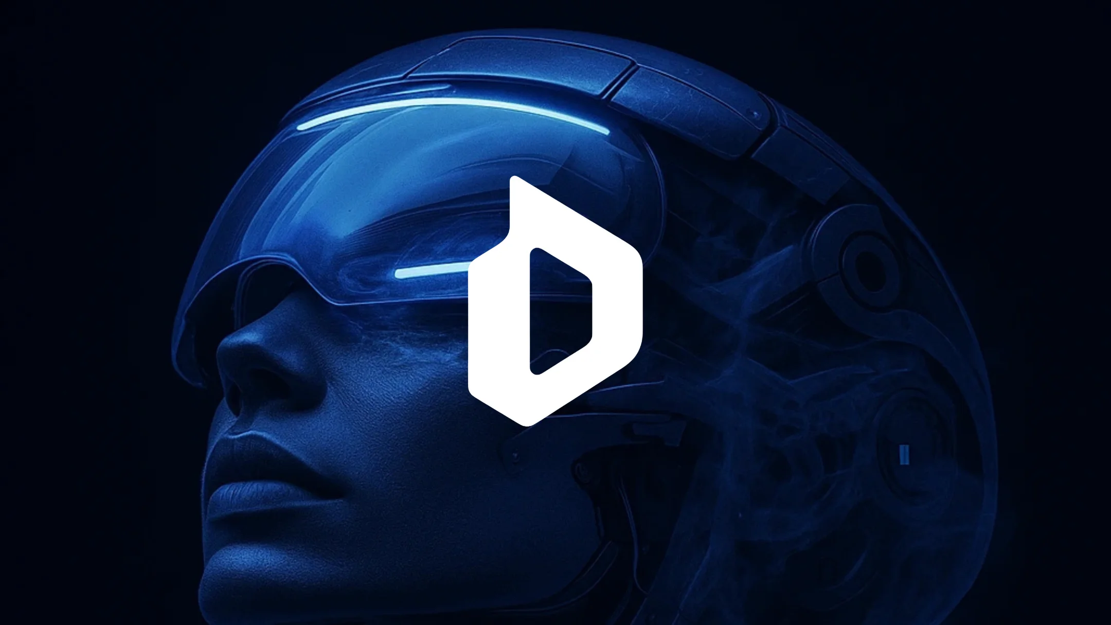
Designed a memorable digital agency brand identity with a modern technological D symbol that instantly communicates premium expertise while remaining minimalist and sophisticated

Client Digiteyes
Year 2025
Services Logo Design, Brand Identity, Visual Guidelines
Duration 1 month
Digiteyes Branding Hero Image

The Challenge

Digiteyes is a premium digital agency offering a wide range of services—from strategic consulting and branding to web development and digital marketing. The challenge was creating a modern logo that stays in your mind and clearly indicates the technology industry without resorting to cliché digital imagery like pixels, circuit boards, or generic tech symbols. The logo needed to communicate premium quality immediately—potential clients should feel confident they're looking at a top-tier agency, not a generic design shop. Digital agency branding is incredibly saturated, with most logos looking derivative or forgettable. Digiteyes needed something different: sophisticated, technological, yet timeless—a mark that works equally well on a business card and a billboard.

Our Role

We handled all design for the complete brand identity package. This included conceptualizing and designing the distinctive symbol logo, selecting the perfect typeface to complement the symbol, creating comprehensive logo variations for different use cases, developing the brand color system, and establishing visual guidelines to ensure consistent application across all touchpoints.

The Approach

Our strategy centered on intelligent abstraction—creating a "D" symbol that feels inherently technological and modern without being literal. The approach was to develop a mark that communicates precision, innovation, and premium quality through geometry and visual balance. We prioritized clean construction, sophisticated proportions, and a minimalist aesthetic that feels contemporary yet enduring. The typography needed to reinforce these values—modern and premium—without competing with the distinctive symbol for attention.
Discovery & Research

We began by analyzing the digital agency market and competitor branding strategies. Most agency logos fall into predictable patterns: abstract geometric shapes with no meaning, literal tech imagery (pixels, circuits, code brackets), or generic wordmarks with trendy fonts. This created a clear opportunity to differentiate Digiteyes through meaningful abstraction and sophisticated execution. We researched successful tech and agency brand identities—companies like Stripe, Figma, and IDEO—that communicate innovation through clean minimalism rather than explicit symbolism. We explored how letterforms could be abstracted into technological expressions without losing recognizability. The key insight: the best agency logos feel modern and timeless simultaneously—they avoid trends while still feeling contemporary.

Design & Development

We sketched dozens of "D" concepts exploring different approaches—geometric construction, negative space play, technological abstraction. The breakthrough came when we discovered a configuration that feels inherently digital through its precise geometry and visual rhythm, while remaining elegant and sophisticated. We refined the symbol obsessively—every angle, every proportion, every curve calculated to achieve perfect optical balance. The mark needed to work at favicon size and large-scale signage, so we tested scalability relentlessly. For typography, we evaluated modern sans-serif typefaces that communicate technological precision and premium quality—something contemporary but not trendy, professional but not corporate. The final typeface selection balances innovation with credibility. We developed multiple logo lockups (symbol-only, wordmark-only, horizontal combination, vertical combination, reversed) to ensure flexibility across digital interfaces, print materials, environmental graphics, and marketing collateral. The color palette evolved through multiple iterations to find the perfect balance between technological sophistication (cool tones) and premium quality (refined contrast)—avoiding cliché tech blues while maintaining digital credibility.

Final Design

The final brand identity features a modern technological "D" symbol logo paired with sophisticated typography that communicates premium digital expertise. The symbol logo is instantly memorable—functioning as both the brand initial and a visual representation of technological precision and innovation. The accompanying wordmark uses a contemporary geometric typeface that feels modern, minimalistic, and premium without feeling cold or sterile. Together, they create a cohesive brand system that positions Digiteyes as the sophisticated, forward-thinking choice in digital agency services.

Brand Assets Delivered

Digiteyes received a complete, production-ready brand identity system designed for immediate implementation across all digital agency touchpoints. The comprehensive package ensures consistent premium positioning in the competitive digital services market.

Complete Brand Package

  • Custom symbol logo featuring modern technological "D" with precise geometric construction
  • Contemporary minimalist wordmark using premium geometric typeface for digital credibility
  • Multiple logo variations (symbol-only, wordmark-only, horizontal lockup, vertical lockup, reversed) optimized for all use cases from social media avatars to large-scale environmental graphics
  • Brand color system balancing technological sophistication with premium quality—avoiding cliché tech aesthetics while maintaining digital credibility
  • Complete brand guidelines including logo usage rules, color specifications, typography standards, and spacing requirements
  • Print-ready and web-optimized logo files in all required formats (AI, EPS, SVG, PNG) with comprehensive file naming conventions

What We Learned

This project reinforced that digital agency logos face a unique challenge—they need to demonstrate design excellence while remaining memorable and versatile. The logo itself is a proof of concept: if an agency can't design a sophisticated mark for themselves, why would clients trust them? We learned that avoiding cliché tech imagery is harder than it seems—every geometric abstraction risks looking like a dozen other agency logos. The solution is obsessive refinement: the difference between "another geometric D" and "the Digiteyes D" comes down to millimeter-level adjustments in proportion and spacing. If we were starting over, we'd prototype more lockup variations earlier—we discovered the vertical configuration late in the process, and it ended up being crucial for social media applications. This experience fundamentally shaped our understanding of agency branding: the mark needs to be sophisticated enough to impress design-savvy clients while simple enough to remain memorable. Balancing those two requirements is the entire challenge.

Like what you see?

Let's create something amazing together

Start Your Project