Back to Work
Design

Aurawin Full Branding Package

Designed a memorable dental brand identity that combines medical credibility with modern premium aesthetics through a clever A+W tooth symbol

Client Aurawin
Year 2025
Services Logo Design, Brand Identity, Visual Guidelines
Duration 1 month
Aurawin Branding Hero Image

The Challenge

Aurawin needed a brand identity that would differentiate them in the crowded premium dental products market. The challenge was creating a modern logo that stays in your mind while still clearly indicating the dental industry—avoiding generic medical aesthetics without sacrificing credibility. Premium dental customers expect sophistication and trust, but the market is saturated with forgettable blue tooth logos and sterile corporate branding. Aurawin needed a visual identity that felt both clinical and approachable, memorable yet professional.

Our Role

We handled all brand design, responsible for the complete identity system from initial concept through final delivery. This included logo design exploration, typography selection, color palette development, creation of brand patterns, and establishment of comprehensive visual guidelines to ensure consistent application across all brand touchpoints.

The Approach

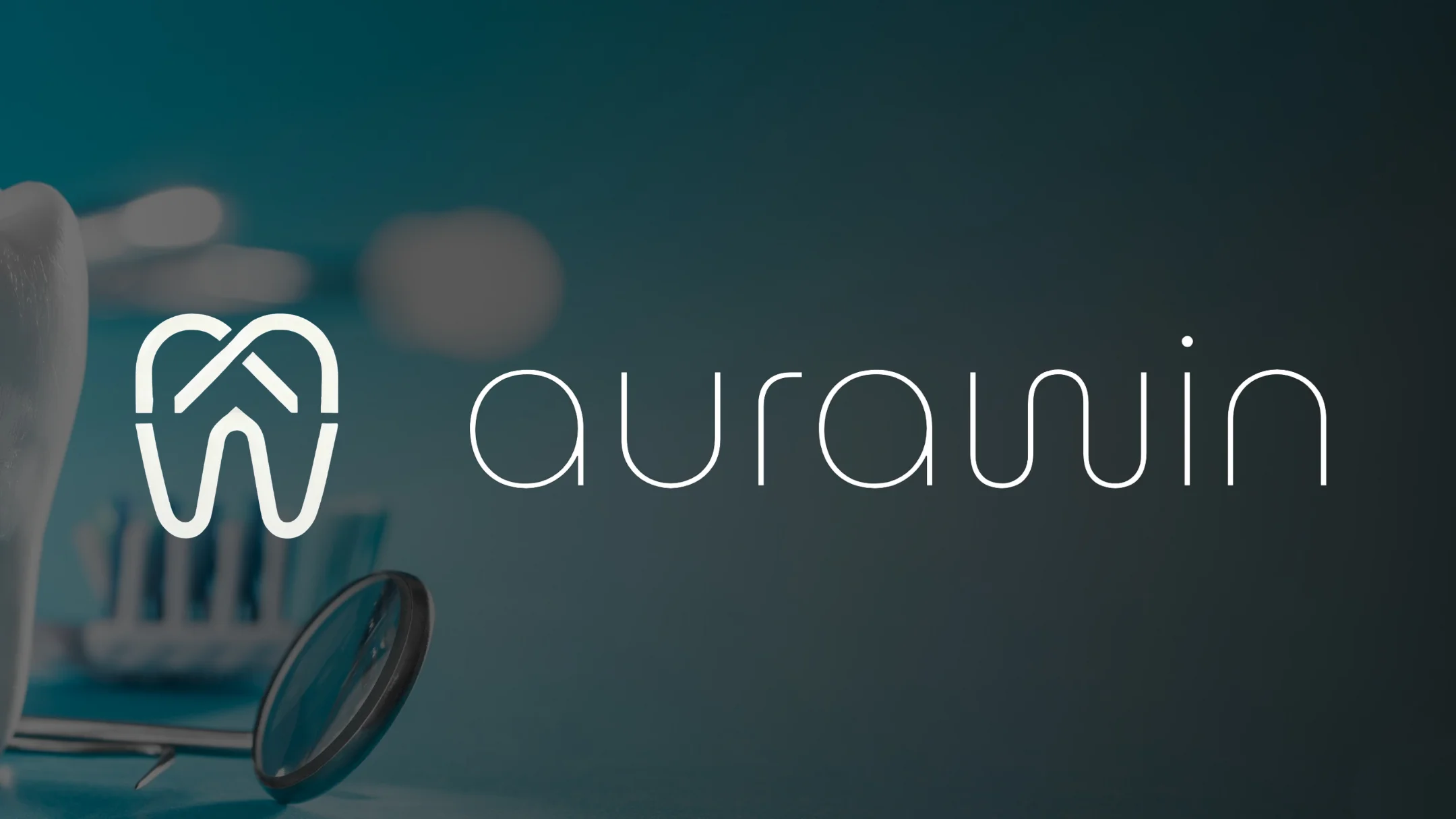
Our strategy was to create a clever symbol that works on multiple levels—immediately recognizable as dental-related, but distinctive enough to stand out from the sea of tooth icons. We focused on combining the initials A+W into a unified mark that subtly forms a tooth shape, creating a smart, memorable solution that feels modern and premium. The design needed to communicate medical precision while maintaining warmth and approachability—sophistication without coldness.

Discovery & Research

We began by analyzing the premium dental product landscape, studying both direct competitors and aspirational brands in adjacent medical aesthetics markets. The research revealed a pattern: most dental brands rely heavily on literal tooth imagery paired with blue color palettes, creating a crowded space where differentiation is nearly impossible. We identified an opportunity to break from convention while maintaining medical credibility. Through client conversations, we learned that Aurawin's target customers are discerning dental professionals who value innovation and design excellence—they're tired of generic medical branding and respond to sophistication. This insight shaped our direction: create something clever and modern that dental professionals would be proud to display in their practices.

Design & Development

We explored dozens of concepts before discovering the A+W tooth fusion—the breakthrough came when we realized the letterforms could integrate seamlessly to create a tooth silhouette without forcing the design. The geometry needed to feel intentional and balanced, not gimmicky. We refined the mark through countless iterations, adjusting curves, proportions, and negative space until the tooth shape emerged naturally from the letters. For the color palette, we deliberately avoided dental industry blue in favor of a sophisticated teal-to-navy gradient that feels fresh, premium, and distinctly modern. Typography selection focused on clean, contemporary sans-serifs that communicate precision and clarity. We developed multiple logo variations (symbol-only, wordmark-only, horizontal, stacked) to ensure flexibility across product packaging, website, business cards, and trade show materials. The accompanying brand pattern system uses abstracted elements from the logo symbol, creating cohesive visual touchpoints across all applications.

Final Design

The final brand identity features a clever fusion of the A and W letterforms that subtly creates a tooth symbol—instantly memorable and distinctly dental without relying on cliché imagery. The sophisticated teal-to-navy color palette breaks from industry conventions while maintaining medical credibility, and the modern typography system communicates precision and innovation. Together, the elements create a cohesive premium brand that dental professionals are proud to display and customers immediately recognize as trustworthy and contemporary.

Brand Assets Delivered

Aurawin received a complete, production-ready brand identity system designed for immediate implementation across all business applications. The comprehensive package ensures consistent premium positioning and instant brand recognition in the competitive dental products market.

Complete Brand Package

  • Custom A+W tooth symbol logo with intelligent letterform fusion creating memorable dental identity
  • Sophisticated teal-to-navy gradient color palette that breaks from industry conventions while maintaining medical credibility
  • Multiple logo variations (symbol-only, wordmark-only, horizontal lockup, vertical lockup, reversed) for product packaging, web, and print applications
  • Modern typography system featuring clean sans-serifs that communicate precision and innovation
  • Brand pattern system using abstracted logo elements for packaging, marketing materials, and trade show displays
  • Comprehensive brand guidelines including color specifications, typography rules, logo usage standards, and application examples
  • Print-ready and web-optimized logo files in all required formats (AI, EPS, SVG, PNG) for seamless implementation

What We Learned

This project reinforced that the best logos work on multiple levels—the A+W tooth fusion is clever without being forced, memorable without being gimmicky. We learned that breaking industry color conventions can be a powerful differentiator when done thoughtfully—the teal palette immediately sets Aurawin apart while maintaining premium medical credibility. The most challenging aspect was achieving the perfect balance where the tooth shape feels intentional but not obvious—it needed to reward closer inspection without being confusing at first glance. If we were starting over, we'd prototype the logo on actual product packaging earlier in the process to validate scale and legibility, as seeing the mark in context revealed refinements we hadn't anticipated in flat designs. This experience deepened our understanding that truly effective branding requires both conceptual cleverness and obsessive attention to execution details.

Like what you see?

Let's create something amazing together

Start Your Project