The Challenge
Digitrack needed a brand identity that could bridge two seemingly contradictory worlds: the traditional warehouse industry and cutting-edge modern technology. The challenge was creating a logo memorable enough to stick in decision-makers' minds while clearly signaling warehouse expertise without resorting to literal imagery like boxes, forklifts, or generic inventory icons. Enterprise software branding often leans too corporate (sterile and forgettable) or too tech-startup (trendy but lacking industry credibility). We needed something that felt both rooted in warehouse operations and unmistakably modern—a visual identity that warehouse managers would trust and tech-forward companies would admire.
Our Role
We handled all brand design for this project, responsible for the complete visual identity. This included conceptualizing and designing the symbol logo, selecting and customizing the wordmark typography, creating combination logos for various applications, developing a complementary brand pattern system, and establishing comprehensive visual guidelines for consistent implementation across all touchpoints.
The Approach
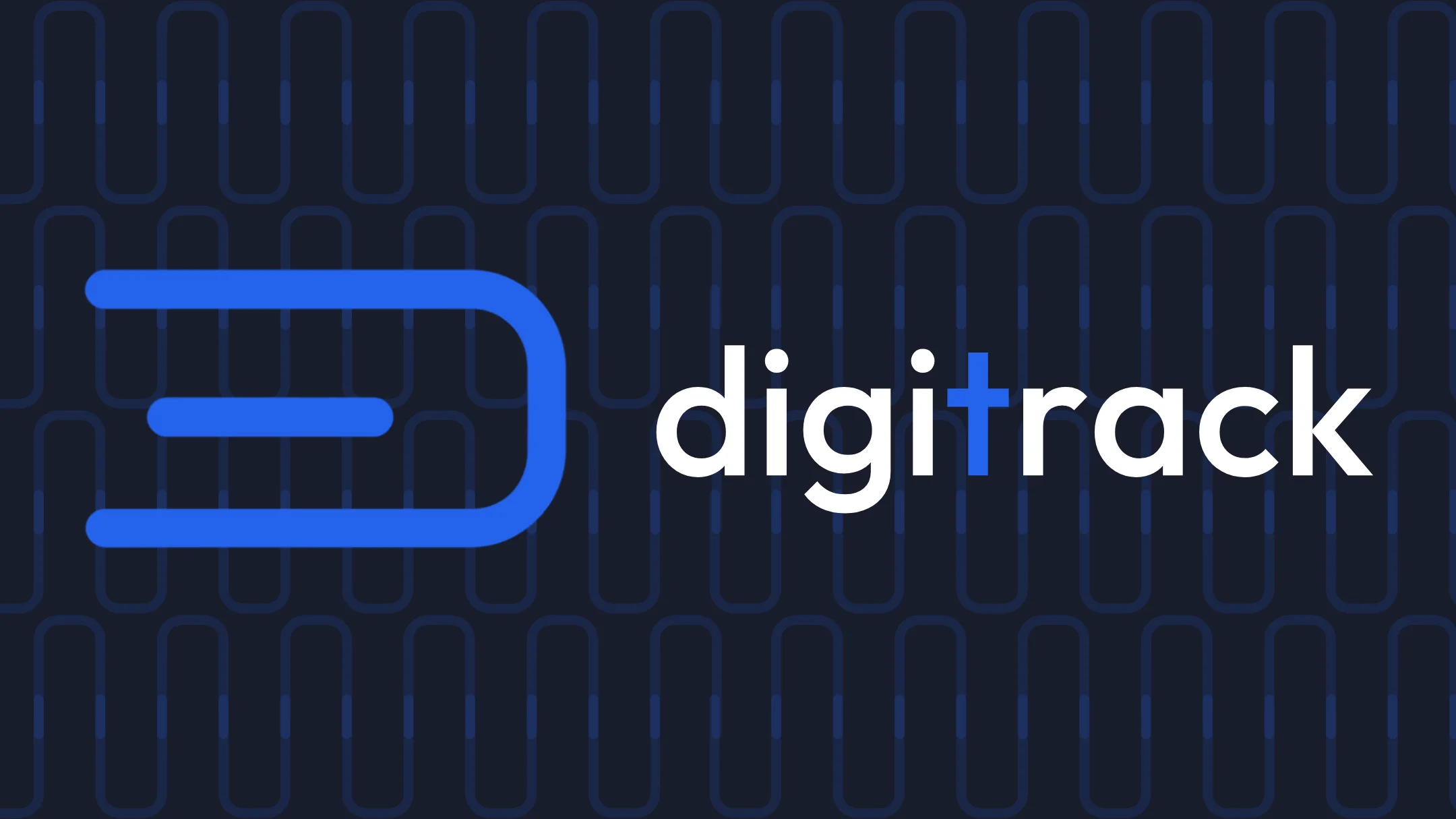
Our strategy focused on intelligent abstraction—finding a visual concept that subtly references warehouse operations without being literal or cliché. The goal was to create a symbol that rewards closer inspection: at first glance, it's a clean, modern lettermark; upon reflection, the warehouse industry connection reveals itself. We prioritized creating a brand that feels contemporary, minimalistic, premium, and technological while maintaining enough industry specificity to differentiate Digitrack from generic enterprise software competitors. The typography needed to reinforce these qualities—modern without being trendy, professional without being stiff.
