Back to Work
Development

Digitrack ERP Website Design & Development

Transformed a 12-module enterprise platform into a clear, compelling marketing story that warehouse managers understand in 30 seconds—not 30 minutes

Client Digitrack
Year 2025
Services UI/UX Design, Webflow Development
Duration 1 month
Visit Project
Digitrack ERP Website Hero Image

The Challenge

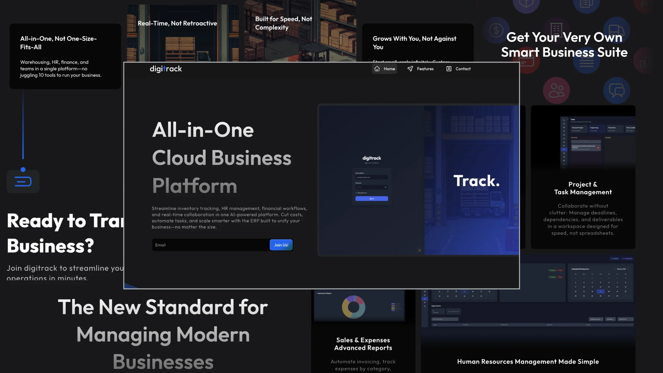
Digitrack is a comprehensive all-in-one ERP platform with 12 integrated modules spanning inventory management, HR, invoicing, real-time messaging, AI automation, and more. The challenge was translating this complexity into a marketing website that doesn't overwhelm visitors. Most enterprise software websites commit the same mistake: they list every feature exhaustively, burying the actual value proposition under walls of technical jargon. Warehouse managers don't have time to read feature lists or watch 20-minute product demos—they need to immediately understand why Digitrack is different and whether it solves their operational chaos. If the website didn't communicate value within seconds, we'd lose them to simpler (though inferior) competitors.

Our Role

We handled all UI/UX design and Webflow development for the Digitrack marketing website. We owned the complete information architecture, designed all page layouts and visual assets, crafted the messaging strategy, and built the entire site in Webflow from scratch to production deployment.

The Approach

Our strategy focused on ruthless prioritization and visual clarity over feature exhaustiveness. Instead of showcasing all 12 modules equally, we identified the key differentiators—the features that truly set Digitrack apart from bloated legacy software—and built the narrative around those. The goal was to communicate through strategic app screenshots paired with concise copy that speaks to real warehouse pain points, not abstract "efficiency gains." Every section needed to answer one question: why should a warehouse manager care about this specific feature right now?

Discovery & Research

We started by analyzing competitor ERP websites in the warehouse management space—nearly all fell into two camps: either minimalist landing pages that hide complexity but provide no substance, or feature-dump sites that list every capability without explaining why it matters. We interviewed warehouse managers to understand their website browsing behavior when evaluating software: they skim quickly, they want to see the actual interface (not abstract diagrams), and they need proof the system won't require a dedicated IT team to operate. The key insight: people buy enterprise software based on trust and clarity, not feature count. They need to see that Digitrack is genuinely simpler than juggling five separate apps, not just another vendor claiming "all-in-one."

Design & Development

We designed the website in Figma with a clear hierarchy: hero section immediately establishes the core value proposition (replace 5 apps with 1 intuitive platform), followed by strategic feature showcases highlighting the most impactful differentiators—real-time inventory tracking, intelligent shelf location, integrated HR, and AI automation. Each feature section pairs carefully selected app screenshots with focused copy that addresses specific pain points warehouse teams actually experience. We built the site in Webflow, prioritizing fast load times and responsive design since warehouse managers often browse on tablets in noisy environments. The visual design balances professional credibility with modern approachability—not too corporate (sterile), not too startup-y (untrustworthy). We implemented smooth scroll interactions and subtle animations to guide attention without creating distraction. The copywriting went through multiple revisions to strike the right tone: confident without arrogance, technical without jargon, benefit-focused without vague promises.

Final Design

The final Digitrack website distills a complex 12-module ERP platform into a clear, compelling narrative. Visitors immediately understand the core value—consolidating fragmented warehouse operations into one intuitive system—through strategic app screenshots and focused messaging. The site converts skeptical warehouse managers by showing, not telling: real interface previews demonstrate the shelf location system, inventory dashboards, and AI automation in action. Fast, responsive, and built to communicate Digitrack's differentiators within the critical first 30 seconds.

Results & Outcomes

The website successfully launched Digitrack's market presence and established credibility in the enterprise warehouse management space. The focused feature storytelling approach effectively communicates complex ERP capabilities without overwhelming visitors, positioning Digitrack as the intuitive alternative to bloated legacy software.

Key Achievements

  • Strategic information architecture that prioritizes key differentiators over exhaustive feature lists—showing what matters most, not everything
  • Visual storytelling through carefully selected app screenshots paired with focused copy addressing real warehouse pain points
  • Complete execution: UI/UX design, information architecture, copywriting, and Webflow development to production
  • Responsive design optimized for both desktop decision-makers and warehouse managers browsing on tablets
  • Fast-loading Webflow implementation with smooth scroll interactions that guide attention without creating distraction
  • Clear messaging hierarchy that immediately communicates Digitrack's core value: replace 5 fragmented apps with 1 intuitive platform

What We Learned

This project reinforced that marketing complex enterprise software requires restraint more than comprehensiveness. The instinct is to showcase every feature because you're proud of the product, but effective marketing websites are about strategic omission—highlighting what differentiates you, not cataloging everything you built. We learned that screenshots are worth a thousand feature bullet points: showing the actual interface builds trust faster than abstract benefit statements. The biggest challenge was resisting stakeholder pressure to add "just one more section" for every module—maintaining focus required constant defense of simplicity over feature sprawl. If we were starting over, we'd spend more time upfront defining which 3-4 features truly differentiate Digitrack before touching design tools, as several layout iterations could have been avoided with clearer strategic positioning. This experience shaped how we approach enterprise marketing sites: your job isn't to explain the entire product—it's to earn enough trust and curiosity that visitors want to learn more.

Like what you see?

Let's create something amazing together

Start Your Project