Back to Work
Design

Monillo GmbH Full Branding Package

Crafted a premium automotive brand identity that elevated Monillo's market positioning from budget-friendly to high-performance specialist

Client Monillo GmbH
Year 2026
Services Logo Design, Brand Identity, Visual Guidelines
Duration 2 weeks
Monillo GmbH Branding Hero Image

The Challenge

Monillo GmbH's existing logo looked outdated and cheap, failing to reflect their premium positioning in the automotive performance market. As specialists in car tuning, high-performance modifications, and premium vehicle sales, their visual identity was actively undermining their business credibility. Customers seeking elite automotive services need to trust they're working with true professionals, and the old branding simply didn't convey that level of expertise.

Our Role

We handled this project, delivering a complete brand identity package. This included designing a distinctive symbol logo, selecting and customizing the wordmark typography, creating combination logos for various use cases, developing a complementary brand pattern, and establishing comprehensive visual guidelines for consistent application across all touchpoints.

The Approach

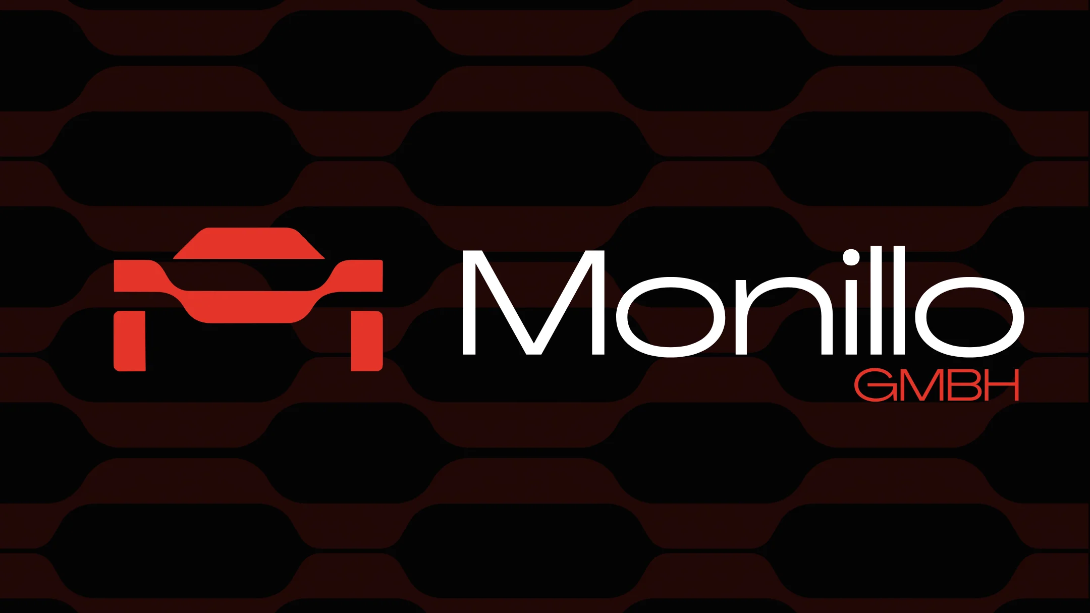
Our strategy centered on balancing two critical brand attributes: performance and trustworthiness. The automotive tuning world demands bold, speed-focused visuals, but Swiss business culture requires credibility and reliability. We chose a vibrant red to communicate speed, power, and performance energy. For typography, we selected AGRANDIR GRAND—a typeface that exudes Swiss precision and premium quality while maintaining strong legibility at any size.
Discovery & Research

We began by analyzing Monillo's market position and competitors in the Swiss automotive performance sector. Through conversations with the client, we identified that their services span car tuning, performance modifications, buying, and selling—requiring a brand that feels both dynamic and trustworthy. We researched visual language in the automotive tuning industry, noting that most brands lean too heavily into aggressive aesthetics or overly corporate feels. The opportunity was clear: create something premium that bridges performance and professionalism.

Design & Development

We explored multiple logo concepts before landing on the "M as car silhouette" symbol—it's instantly recognizable, automotive-focused, and clever without being gimmicky. The red color palette went through several iterations to find the perfect balance between aggressive and refined. AGRANDIR GRAND became the typeface after testing over a dozen premium fonts—it has that Swiss engineering precision while feeling modern and confident. We developed multiple logo lockups (symbol-only, wordmark-only, and combination) to ensure flexibility across business cards, vehicle wraps, websites, and signage. The accompanying brand pattern uses abstracted elements from the logo to create cohesive visual systems.

Final Design

The final brand identity combines an iconic red "M" symbol shaped like a car silhouette with the sophisticated AGRANDIR GRAND typeface. The symbol instantly communicates speed and automotive focus, while the typography adds the premium, trustworthy feel that Swiss customers expect. Together, they create a cohesive brand that positions Monillo as the go-to choice for serious automotive performance.

Brand Assets Delivered

Monillo received a complete, production-ready brand identity system designed for immediate implementation across all business touchpoints. The comprehensive package ensures consistent premium positioning in every customer interaction.

Complete Brand Package

  • Custom symbol logo featuring the iconic "M" car silhouette in performance red
  • Wordmark logo using AGRANDIR GRAND typeface for premium credibility
  • Multiple logo variations (symbol-only, wordmark-only, horizontal lockup, vertical lockup, reversed) for all use cases
  • Brand pattern system for backgrounds, merchandise, and marketing materials
  • Complete brand guidelines including color codes, typography rules, and usage specifications
  • Print-ready and web-optimized logo files in all required formats (AI, EPS, SVG, PNG)

What We Learned

This project reinforced how critical cultural context is in branding. What works in the aggressive, bold US tuning market doesn't necessarily translate to Swiss business culture, where trust and precision matter as much as performance. We learned to push back on our initial instinct to go maximalist with automotive aesthetics. The most challenging part was finding that sweet spot where the brand feels exciting without looking reckless. If we were to do this again, we'd spend more time upfront defining the exact emotional balance the client wants customers to feel—it would have saved three rounds of color refinements.

Like what you see?

Let's create something amazing together

Start Your Project