Back to Work
Design

Seamless Dispatch Full Branding Package

Created a professional logistics brand identity that elevated Seamless Dispatch from startup to credible dispatcher service provider trusted by US carriers

Client Seamless Dispatch
Year 2025
Services Logo Design, Brand Identity, Visual Guidelines
Duration 1 week
Seamless Dispatch Branding Hero Image

The Challenge

Seamless Dispatch was launching as a new dispatcher service in the highly competitive US freight logistics market, where trust and credibility determine success. Carriers are inherently skeptical of new dispatch companies—they've been burned by unreliable operators who disappear after a few months, leaving drivers stranded without loads or payment. Without an established reputation or referral network, Seamless Dispatch needed a brand identity that would immediately signal professionalism, reliability, and legitimacy. The visual identity had to work equally hard as the service itself to convince carriers that this wasn't just another fly-by-night operation.

Our Role

We handled this project, delivering a complete brand identity from concept to final assets. This included designing the primary logo symbol, developing the wordmark typography, creating comprehensive logo lockups for different contexts, establishing the brand color system, designing supporting brand patterns, and producing detailed visual guidelines to ensure consistent application across all business materials and digital platforms.

The Approach

Our strategy focused on communicating two core attributes: efficiency and trustworthiness. The freight dispatch industry demands speed—carriers need loads fast, dispatchers need to move quickly—but it also requires rock-solid reliability. We avoided the overly aggressive or flashy aesthetics common in logistics branding, instead opting for a clean, modern identity that conveys competence and professionalism. The visual language needed to feel established and credible despite being a new company, so we prioritized timeless design over trendy elements that might date the brand.
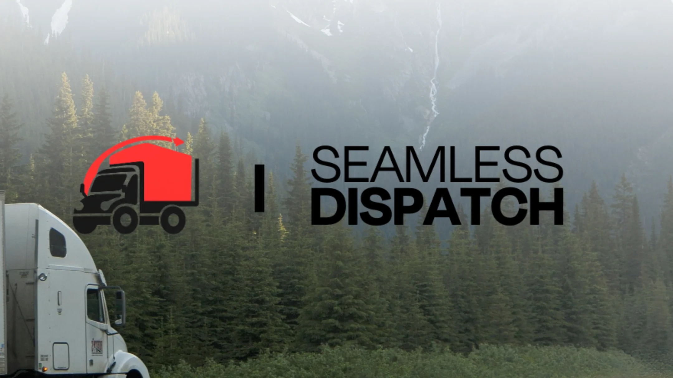
Discovery & Research

We began by analyzing the freight dispatch competitive landscape, noting that most established companies have minimal visual identity—often just text-based logos or generic truck graphics. We researched what makes carriers trust a dispatcher service, conducting informal interviews with drivers and fleet owners to understand their decision-making process. The insights were clear: carriers look for signs of professionalism (clean branding, professional materials), longevity (nothing that screams "startup"), and accessibility (approachable, not corporate). We studied successful service brands in adjacent industries like financial services and insurance to understand how businesses build trust through visual identity when entering competitive markets.

Design & Development

We explored multiple logo concepts before landing on a clean, geometric mark that subtly references movement and logistics flow without being literal or clichéd. The symbol suggests forward motion and connectivity—essential qualities for a dispatch service. The wordmark uses a professional sans-serif typeface with custom modifications to balance approachability with authority. The color palette went through several iterations before settling on deep navy blue paired with energetic orange accents—navy conveys trust and stability, while orange communicates speed and accessibility without feeling cheap. We developed comprehensive logo variations (horizontal, stacked, icon-only, reversed) to ensure the brand works across every application from business cards to truck wraps. The brand guidelines include precise specifications for color usage, typography hierarchy, spacing requirements, and real-world application examples to maintain consistency even when materials are produced by third parties.

Final Design

The final brand identity combines a distinctive geometric logo mark with clean, professional typography and a strategic navy-orange color system. The symbol communicates movement and connectivity without resorting to obvious truck or road imagery, while the wordmark establishes credibility and approachability. Together, they create a cohesive brand that positions Seamless Dispatch as a modern, trustworthy dispatcher service—professional enough to inspire confidence, approachable enough to attract carriers looking for reliable partnerships.

Brand Assets Delivered

Seamless Dispatch received a production-ready brand identity system designed for immediate launch and consistent implementation across all customer and carrier touchpoints. The comprehensive package provides everything needed to establish credibility and professionalism in the competitive freight dispatch market.

Complete Brand Package

  • Custom geometric logo mark suggesting movement and connectivity, scalable from business card to billboard
  • Professional wordmark using custom-modified sans-serif typography for credibility and approachability
  • Navy blue and orange color system balancing trust, reliability, speed, and accessibility
  • Multiple logo variations (horizontal, stacked, icon-only, reversed) for all business applications
  • Comprehensive brand guidelines including color specifications, typography rules, spacing requirements, and usage examples
  • Print-ready and web-optimized logo files in all required formats (AI, EPS, SVG, PNG)

What We Learned

This project reinforced that trust-building through brand identity requires understanding your audience's skepticism and addressing it visually. Carriers in the freight dispatch world have legitimate reasons to be cautious about new companies, so the brand couldn't feel too fresh or startup-like—it needed to project established credibility even on day one. The biggest challenge was avoiding logistics industry clichés (trucks, roads, arrows) while still feeling relevant to the industry. If we were approaching this again, we'd spend more time testing logo concepts with actual carriers before finalizing—our initial direction was too modern and abstract for the conservative audience. This experience shaped how we think about branding for service businesses entering markets dominated by established players: you can't win on flashiness, you win on perceived reliability and professionalism.

Like what you see?

Let's create something amazing together

Start Your Project