Back to Work
Design

Sherif Sherifi Full Branding Package

Created a timeless legal brand identity that balances professional authority with modern approachability through iconic justice scale symbolism

Client Sherif Sherifi
Year 2025
Services Logo Design, Brand Identity, Visual Guidelines
Duration 1 month
Sherif Sherifi Branding Hero Image

The Challenge

Sherif Sherifi, an experienced attorney, needed a brand identity that would establish credibility in the legal market while standing apart from the sea of generic law firm branding. The challenge was creating a visual identity that communicates legal expertise and trustworthiness without falling into the tired clichés that dominate attorney branding—overly formal, cold, and indistinguishable from competitors. Legal clients need to feel confident they're working with a serious professional, but they also need to feel comfortable and welcomed. The brand needed to reflect both the timeless authority of justice and the contemporary values of accessibility and client-centered service.

Our Role

We handled all brand design for this project, responsible for the complete visual identity system. We designed the justice scale symbol logo, selected and customized the typography, created all brand lockups and variations, developed the comprehensive visual guidelines, and delivered production-ready assets across all required formats for business cards, letterhead, digital platforms, and signage.

The Approach

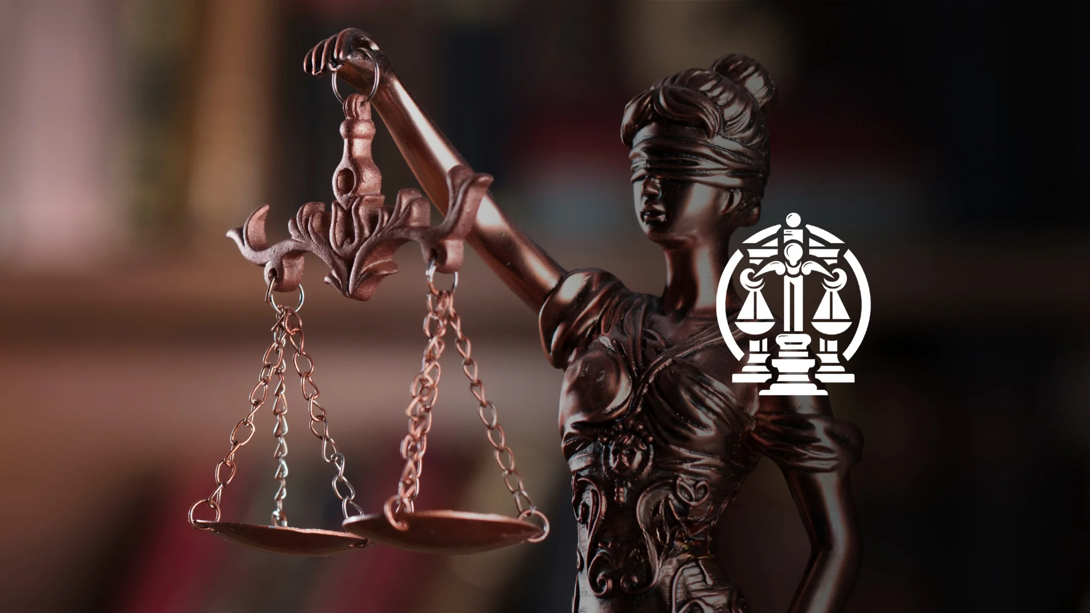
Our strategy centered on reimagining classic legal symbolism through modern design principles. The justice scale is universally recognized in legal contexts, but most attorney logos treat it as a literal illustration. We focused on creating a refined, minimalist interpretation that feels timeless rather than dated, sophisticated rather than stuffy. The goal was to leverage the immediate recognition of legal symbolism while executing it with contemporary elegance. Typography and color choices prioritized professional credibility with subtle warmth—trustworthy without being cold, authoritative without being intimidating.

Discovery & Research

We began by analyzing the legal branding landscape, and the patterns were clear: most attorney logos fall into predictable categories—classical column illustrations, literal justice scales with excessive detail, generic serif wordmarks, or corporate-style abstract marks that could belong to any industry. Through conversations with Sherif, we identified that his practice emphasizes personal attention, clear communication, and modern accessibility while maintaining the highest professional standards. We researched how contemporary legal brands differentiate themselves and studied minimalist approaches to symbolic design. The key insight: legal symbolism works when executed with restraint and sophistication—clients need to instantly recognize the legal context, but the execution should feel refined and current, not dated.

Design & Development

We explored multiple interpretations of the justice scale symbol before landing on a clean, geometric approach that strips away unnecessary ornamentation while preserving the iconic form. The design is immediately recognizable as legal symbolism but feels modern and sophisticated rather than traditional and heavy. The balance and symmetry inherent in the scale naturally communicate fairness and precision—core values for any attorney. We tested numerous typography pairings before selecting a typeface that balances professional authority with contemporary readability. The color palette went through several iterations to find the right tone: credible and trustworthy without being cold or intimidating. We developed multiple logo lockups (symbol-only, wordmark-only, horizontal combination, vertical combination, reversed) to ensure versatility across business cards, letterhead, website, signage, and legal documents. The brand guidelines establish clear usage rules while providing flexibility for various applications—from formal court documents to approachable client communications.

Final Design

The final brand identity combines a refined justice scale symbol with sophisticated typography to create a timeless yet contemporary legal brand. The minimalist scale instantly communicates legal expertise and fairness while maintaining modern elegance. The result is a cohesive brand system that positions Sherif Sherifi as a professional, trustworthy attorney who values both tradition and accessibility—standing apart from generic legal branding through thoughtful restraint and contemporary execution.

Brand Assets Delivered

Sherif Sherifi received a complete, production-ready brand identity system designed for immediate implementation across all legal practice touchpoints. The comprehensive package ensures consistent professional positioning from client-facing materials to formal court documents.

Complete Brand Package

  • Custom justice scale symbol logo featuring refined, minimalist geometric design that feels timeless and sophisticated
  • Professional wordmark typography balancing legal authority with contemporary approachability and excellent readability
  • Multiple logo variations (symbol-only, wordmark-only, horizontal lockup, vertical lockup, reversed) optimized for all legal applications
  • Comprehensive brand color palette communicating trust and professionalism with subtle warmth and accessibility
  • Complete brand guidelines including logo usage rules, color specifications, typography systems, and application examples for legal materials
  • Print-ready and web-optimized brand assets in all required formats (AI, EPS, SVG, PNG) for business cards, letterhead, court documents, and digital platforms

What We Learned

This project reinforced that classic symbolism doesn't have to mean dated design—reimagining familiar legal imagery through minimalist, contemporary execution creates immediate recognition with modern sophistication. Legal branding presents a unique challenge: clients expect traditional markers of credibility, but they also respond to accessible, human-centered design. We learned that the key is finding the balance—honoring legal traditions while embracing contemporary aesthetics. The biggest challenge was resisting the temptation to over-design the justice scale symbol; the final version went through multiple rounds of simplification before achieving the right level of refinement. If we were starting over, we'd prototype the logo in real-world legal applications earlier—seeing it on business cards, letterhead, and court documents helped refine proportions and legibility faster than working purely in design software. This experience shaped our understanding that professional service branding requires understanding industry expectations while finding opportunities to differentiate through thoughtful, restrained design execution.

Like what you see?

Let's create something amazing together

Start Your Project