The Challenge
Solar Sync needed a brand identity that would stand out in the increasingly crowded solar energy market while remaining instantly recognizable and memorable. The core challenge was creating a modern logo that stays in your mind and clearly indicates the solar industry without resorting to cliché sun icons or overly literal imagery. The logo needed to work at any size—from tiny app icons to massive solar panel installations—while communicating innovation, reliability, and clean technology. Solar companies often fall into the trap of looking either too corporate and boring or too eco-friendly and soft. Solar Sync needed something different: premium, technological, and forward-thinking.
Our Role
We handled all design for the complete brand identity package. This included conceptualizing and designing the distinctive symbol logo, selecting the perfect typeface to complement the symbol, creating comprehensive logo variations for different use cases, developing the brand color system, and establishing visual guidelines to ensure consistent application across all touchpoints.
The Approach
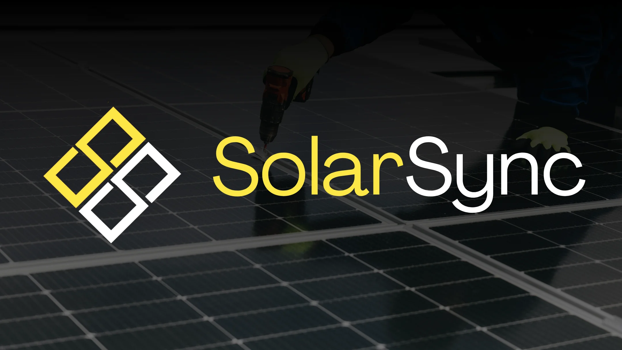
Our strategy centered on intelligent abstraction—taking the "SS" initials from Solar Sync and transforming them into a solar panel shape that's both clever and functional. The approach was to create a symbol that works on multiple levels: it reads as the brand initials, it visually represents solar panel grid structure, and it feels modern and premium. We prioritized clean geometry, precise angles, and a minimalist aesthetic that communicates technological sophistication. The typography needed to reinforce these values—clean, modern, and premium—without competing with the distinctive symbol.
